

Every Body Has a Story: A Bespoke 2D Animation Campaign
The Project
The Medihelp “Everybody” campaign was based on a simple idea: the organisation supports every body. Instead of grouping members by demographic, the campaign recognised the different personalities, interests and ways of living represented across its membership.
The client had already developed character names such as KindBody, HomeBody, BraveBody, SmartBody, CreativeBody, FitBody, HealthyBody, FunBody and AmbitiousBody. Each name represented a recognisable personality, giving members an opportunity to identify with one or more of the characters.
At the start of the project, however, these characters existed only as names. There were no character designs, stories, illustration styles, colour systems or principles governing how the characters would move. This was therefore a bespoke 2D animation project that required Sound Idea Digital to create the characters, visual language and motion system from the ground up.
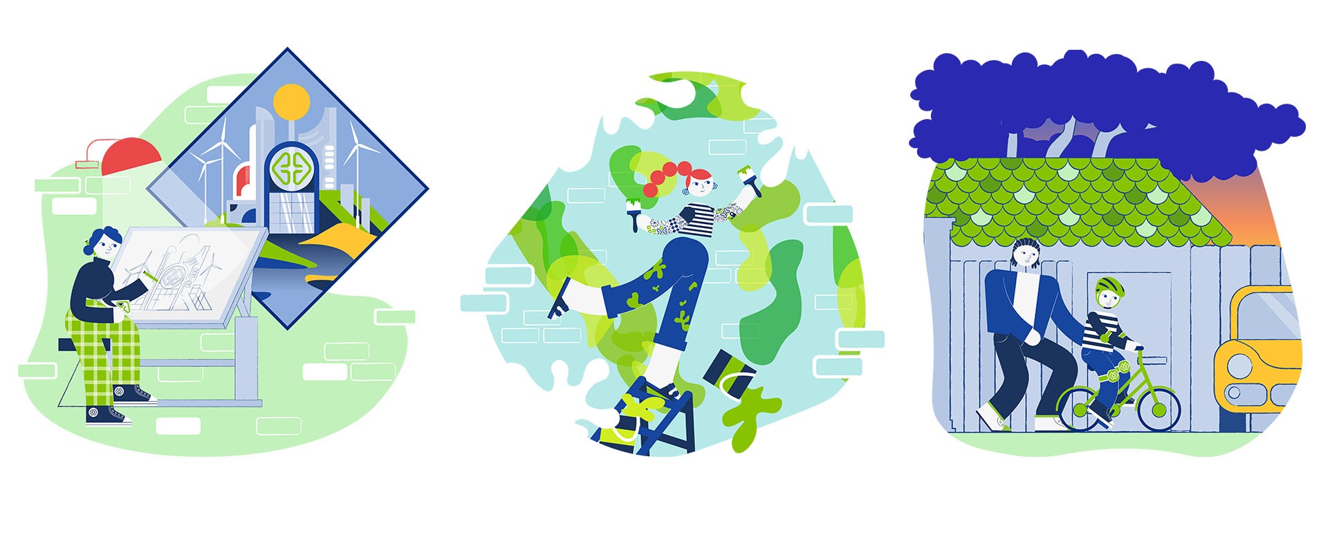
Creating the Campaign from the Ground Up
Each animation needed to communicate a complete idea within approximately 10–15 seconds. As the films contained no voice-over, every character, action, transition and sound needed to contribute to the story.
The character system also had to represent a diverse South African membership. Differences in culture, age, skin tone, hairstyle, body shape, personality and lifestyle needed to be reflected without reducing people to stereotypes. The aim was to create ordinary, relatable characters whose positive traits allowed viewers to recognise aspects of themselves.
These requirements shaped a development process in which the illustration style, character system and storytelling principles were established before animation production began.
Exploring the Visual Direction
Sound Idea Digital developed three illustration directions for the client to consider: playful, abstract and classic. Each presented a different approach to character design, emotion, movement and brand alignment.
This exploration allowed the client to compare complete creative directions rather than approve individual design elements without context. Once the preferred route was selected, the illustration style was refined to establish a consistent look that could support both the initial campaign and future applications.
Colour was explored as a separate part of this process. Multiple systems were considered before the final palette was selected, ensuring that the colours could distinguish individual scenes and personalities while creating a recognisable brand language.
Developing a Connected Character Family
Each “Body” was designed as an individual with distinct interests, behaviours and personal qualities. At the same time, shared proportions, colour relationships and illustration principles connected the characters as members of one visual family.
This balance was central to the campaign. Too much uniformity would have weakened the individual personalities, while too much variation would have made the characters feel unrelated. The resulting system allowed every Body to stand apart while remaining connected to the wider Everybody concept.
The system was also designed to accommodate supporting characters and new personalities. This gave the client a foundation that could expand without having to redefine the campaign’s visual approach whenever another character was introduced.
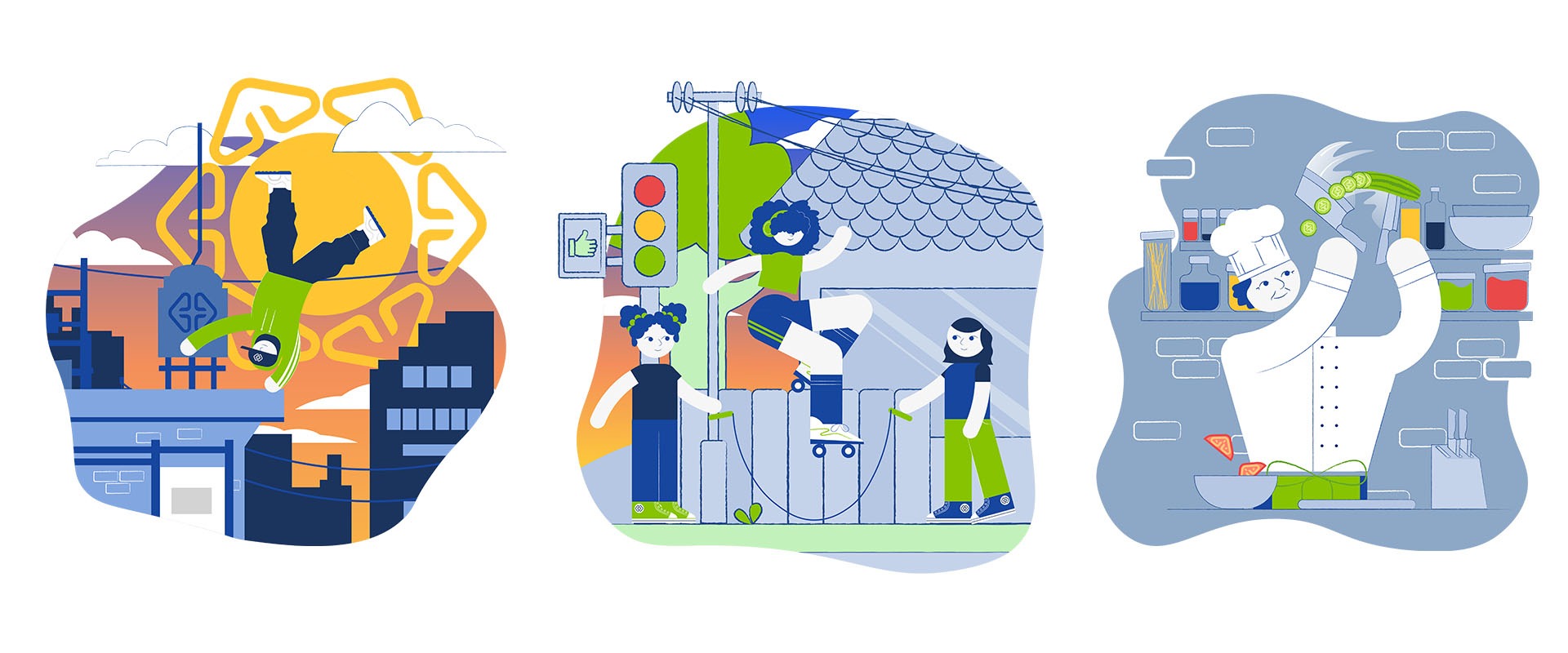
Telling Complete Stories Without Dialogue
Several story concepts were developed for each Body before the client selected the routes that would proceed to storyboarding. This allowed the narrative direction to be agreed upon before time was invested in detailed illustration, rigging and animation.
The approved concepts were then translated into storyboards that mapped the action, pacing, camera movement, transitions, logo integration and final reveal. These storyboards served as production blueprints, giving the client a clear view of how each film would unfold before animation began.
Although the finished films were only 10–15 seconds long, each followed a clear beginning, middle and end. Expressive movement, visual humour, environmental details, music and sound effects replaced spoken explanation, allowing each personality to be understood within seconds.
Making the Logo Part of the Story
A defining feature of the campaign was the way the logo was integrated into the animated world. Instead of appearing only at the beginning or end of each film, its shape became part of the action.
Across the campaign, the logo transformed into windows, glasses, skateboard ramps, architectural tools, flowers, tomatoes, graffiti, puzzle pieces and city structures. In some scenes, the transformation appeared as a subtle visual detail; in others, it became central to the story.
This approach maintained brand recognition without repeating the same logo treatment in every animation. It also established a creative principle that could support future stories: the brand remained visible because it formed part of each character’s world.
A Collaborative Production Process
The project followed a staged review and approval process, beginning with a kick-off workshop and continuing through style presentations, illustration refinement, colour exploration, character approvals, story selection, storyboard reviews and animation reviews.
At each stage, the client received considered options and the information needed to evaluate them. Key decisions were therefore made before the following production phase began, reducing the risk of major changes after characters had been rigged or scenes animated.
This structure gave the client an active role in shaping the campaign while keeping production focused. It also ensured that feedback on colour, character design or story direction could be resolved before it affected the wider system.
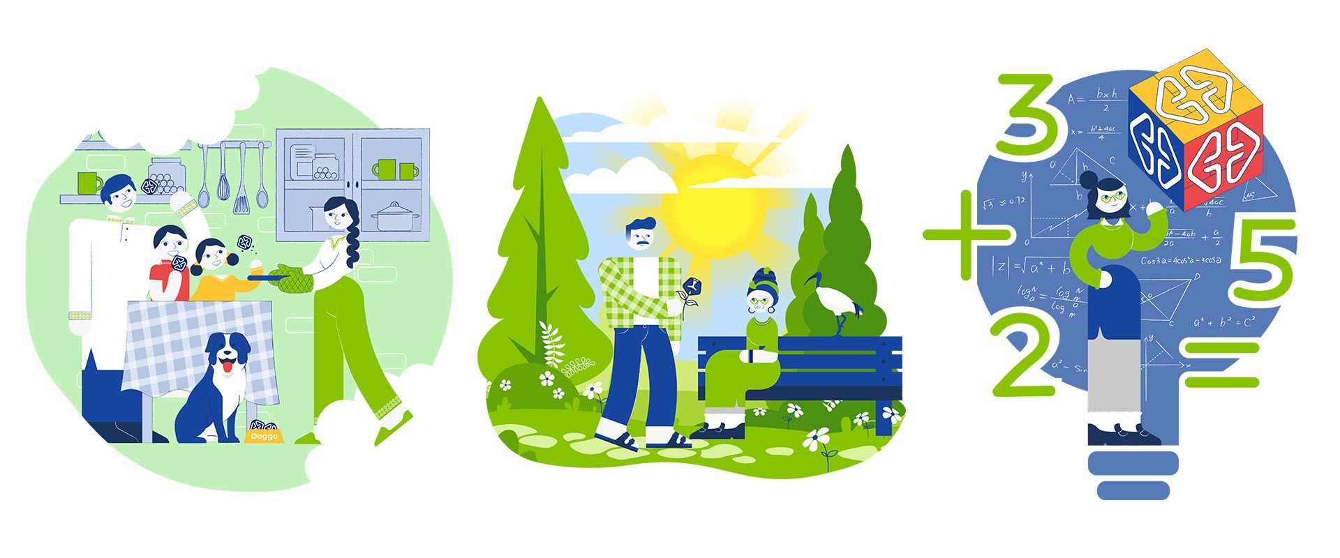
Extending the Value Beyond the Animations
A bespoke 2D animation project requires substantial development before animation begins. Each character must be illustrated, prepared for movement, rigged and tested. Sound Idea Digital therefore recommended developing a long-term visual system rather than limiting the project to a once-off collection of videos.
Alongside the completed animations, the client received a character library, open artwork and production files, illustration assets, rigged characters, colour systems, storyboards, animation principles, guidelines and handover documentation. Multiple output ratios were also produced for use across different digital platforms.
This expanded delivery allowed the characters to be used beyond their original animations and supported the continued development of the campaign across future marketing and member communications. The assets have since been applied to additional materials, extending the value of the original production.
The Outcome
The Everybody campaign established a visual language built around the brand’s members. Each character expressed an individual personality, while the shared design and motion system connected them as part of one campaign.
The bespoke 2D animation project also created the technical and creative foundation required for the concept to keep growing. Rather than receiving only a set of completed animations, the client received the characters, assets, guidelines and production files needed to extend the system into future communications.
The final campaign reinforced the message that the organisation supports every body, regardless of personality, lifestyle or background. The client described the work as unique, memorable and recognisably its own—a visual system it could continue using beyond the original campaign.
If your campaign needs more than a once-off animation, Sound Idea Digital can develop a character and motion system built for continued use. We can help you define the illustration style, characters, stories and reusable assets needed to support future communications. Get in touch with us to discuss how your campaign idea could be developed into a lasting visual system.