

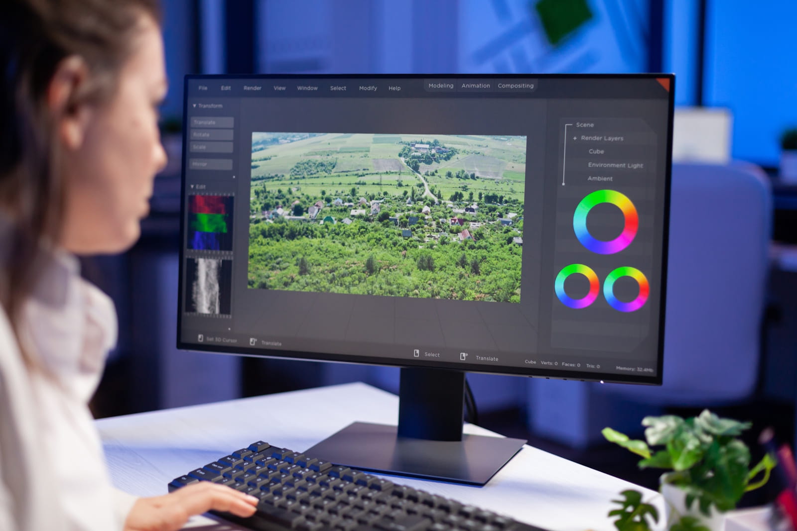
Colour Grading in Corporate, Commercial and Training Videos
Colour grading in corporate, commercial and training videos follows the same basic process, but it does not pursue the same creative result. Every video has a particular audience, message and viewing environment. A corporate production may need to build trust, while a commercial must attract attention and encourage action. A training video needs to present information clearly and consistently. The colourist must understand these goals before adjusting the footage.
Colour choices influence how viewers interpret a scene. Even subtle changes to warmth, contrast and saturation can affect whether a video feels welcoming, energetic, serious or instructional.
Colour Grading in Corporate, Commercial and Training Videos Starts With Different Goals
Colour grading shapes the final appearance and emotional tone of recorded footage. It takes place during post-production, usually after the editor has completed the main edit and corrected basic visual problems. The process can change brightness, contrast, colour temperature, saturation and individual colour ranges. These adjustments help every shot feel connected to the rest of the production.
The desired outcome depends on the purpose of the video. Corporate content often needs a polished and credible appearance. Commercial content may use stronger creative choices to stand out. Training content usually needs a clean, natural look that makes demonstrations and important details easy to follow. A successful grade supports the message instead of drawing attention away from it.
Understanding Colour Correction and Colour Grading
Colour correction and colour grading serve different purposes. Colour correction fixes technical inconsistencies in the footage. It can balance exposure, correct white balance and match shots recorded under different lighting conditions. For example, an interview filmed near a window may look cooler than footage captured beneath indoor lights. Correction brings these shots to a consistent starting point.
Colour grading adds the creative treatment after correction. It develops the visual style and supports the intended mood. Colour grading in corporate, commercial and training videos may use different palettes, but each project still requires accurate skin tones, controlled highlights and balanced shadows. Correction makes the footage look right, while grading makes it feel appropriate for the production.
Colour Grading in Corporate, Commercial and Training Videos Requires Brand Awareness
Corporate videos often introduce an organisation, communicate internal information or share its values. Their colour grade should support trust, professionalism and authenticity. Natural skin tones matter in interviews, leadership messages and employee stories because unnatural colours can distract viewers. A clean image with controlled contrast usually creates a confident appearance without making the footage feel overly dramatic.
Brand identity also influences the grade. A warm treatment can make workplace footage feel friendly and people-focused. A cooler palette may suit technical, financial or industrial subjects. However, the colourist should not simply apply a brand colour across every shot. The grade should complement branded graphics, clothing, locations and visual elements while keeping people and products believable.
Important brand considerations during colour grading include:
- Maintaining natural and believable skin tones
- Complementing established brand colours
- Matching live-action footage with branded graphics
- Choosing a visual tone that reflects the organisation’s identity
- Keeping colour treatments consistent across different scenes
- Ensuring workplace locations remain credible and recognisable
- Using contrast and saturation without overpowering the message
- Creating a consistent look across related video campaigns
Brand awareness requires more than copying colours from a logo. A colourist needs to understand the qualities that the organisation wants to communicate, such as reliability, innovation, warmth or technical expertise. These qualities can guide decisions about colour temperature, contrast and saturation. A restrained approach may support authority, while warmer and softer tones can make people-focused communication feel more approachable.
Consistency also helps audiences recognise content from the same organisation. When separate videos share a considered visual style, they feel connected even if teams filmed them at different times or locations. This does not mean every production must look identical. The colour grade can adapt to each message while retaining familiar visual qualities that support the wider brand identity.
Matching Corporate Footage From Different Locations
Corporate productions often include footage from offices, factories, mines, warehouses and outdoor locations. South African sunlight can create strong highlights and deep shadows, while industrial interiors may contain several types of artificial light. These conditions can make footage look inconsistent when editors place the shots together.
A careful grade balances these differences and creates visual continuity. The colourist can reduce distracting colour casts, recover visible detail and match cameras used in different locations. This process helps the final video feel like one coordinated production, even when the team filmed it over several days or in different provinces.
Colour Grading in Corporate, Commercial and Training Videos Changes for Advertising
Commercial videos compete for attention and often have a short time to create an impression. Their grading can therefore use richer colours, stronger contrast and more distinctive visual treatments. These choices help products, people and settings look appealing. However, bold does not always mean bright. A luxury commercial may use restrained colours and deep contrast, while an energetic campaign may benefit from a more vibrant palette.
Colour grading in corporate, commercial and training videos must always reflect the intended audience. In commercial work, the grade should support the feeling that the campaign wants viewers to associate with the offer. Warm colours can suggest comfort and familiarity. Cooler colours can communicate precision or freshness. Muted colours may create a refined or serious tone.
Commercial colour grading may involve:
- Increasing contrast to create a stronger visual impact
- Using colour temperature to shape the mood
- Adjusting saturation to support energy or restraint
- Directing attention towards a featured product or person
- Protecting accurate product and packaging colours
- Matching the grade to the intended audience
- Creating continuity across different campaign videos
- Balancing creative style with a clear marketing message
The colourist must consider what viewers should notice first and how each scene supports the campaign. Selective adjustments can guide attention towards a product, expression or important action without making the technique obvious. Careful control matters because excessive contrast or saturation can make footage feel artificial and distract viewers from the intended message.
A commercial grade should also work with the pace and structure of the edit. Energetic scenes may benefit from bright, lively colours, while reflective moments may need a softer treatment. These changes should still feel connected. A coherent visual direction helps the commercial build a recognisable atmosphere from its opening shot to its final message.
Presenting Products Accurately
Creative grading should never make a product look misleading. Customers need to recognise its colour, finish and key features. This becomes especially important when a commercial shows clothing, food, packaging, vehicles or property. The colourist must protect important product colours while creating an engaging overall style.
The production team should identify these priorities before filming. Lighting, location colours, set design and wardrobe all affect the final grade. When the team plans them together, the colourist has greater control and can create a distinctive look without damaging accuracy.
Accurate product presentation requires attention to:
- The true colour of the product
- The appearance of materials, surfaces and finishes
- Important packaging and brand colours
- Visible texture and fine details
- Highlight control on reflective objects
- Natural contrast between the product and its background
- Consistency between close-ups and wider shots
- The product’s appearance under different lighting conditions
Colour accuracy becomes more difficult when a production combines footage from several cameras or locations. A product may appear warmer, cooler, brighter or darker from one shot to the next. The colourist must match these differences carefully so viewers see one consistent product throughout the video. This creates a more credible presentation and prevents visual changes from becoming a distraction.
Accuracy does not remove the opportunity for creativity. The surrounding environment can receive a distinctive treatment while the product retains its recognisable colour and detail. Selective adjustments can separate the subject from the background, refine reflections and guide attention towards important features. The final image can feel polished and engaging without misrepresenting what the audience sees.
Creating Visual Impact Without Losing Consistency
Commercial productions may combine live-action footage, aerial views, animation and motion graphics. Each element can have a different visual character. The grade helps live-action material sit naturally beside the designed elements. It can also create smooth transitions between interior, exterior and aerial scenes.
Consistency becomes especially important when a campaign needs several versions for websites, presentations and other viewing environments. A recognisable visual treatment helps the separate videos feel connected. The grade should remain clear and effective on different screens, rather than relying on extreme brightness or saturation.
Colour Grading for Training Videos Prioritises Clarity
Training videos teach viewers how to complete a process, use equipment or follow a procedure. Colour should make the information easier to understand. Strong stylistic effects can hide details or change the appearance of objects, so training productions generally benefit from accurate colours, moderate contrast and even brightness.
When colour grading in corporate, commercial and training videos, the colourist must consider how viewers will use the content. A trainee may need to identify a warning light, control, safety sign or piece of protective equipment. The grade must keep these elements clear. It should also help instructors, demonstrations and supporting graphics remain visible throughout the lesson.
Managing Difficult Training Environments
Many South African training and induction videos take place in factories, workshops, mines, construction areas and other operational settings. These environments often contain harsh sunlight, dark workspaces, dust and mixed artificial lighting. Reflective equipment can create bright highlights, while protective clothing may hide detail in the shadows.
Colour grading can balance these conditions, but it cannot replace careful filming. The production team still needs suitable lighting, exposure and camera settings. Post-production then refines the captured material, matches the shots and improves visibility. The result should look professional while remaining faithful to the real working environment.
Colour Grading in Corporate, Commercial and Training Videos Depends on Technical Priorities
Every production needs shot-to-shot consistency, but the most important details change with the format. Corporate videos prioritise natural people and credible locations. Commercials focus on products, atmosphere and visual appeal. Training videos place clarity, accuracy and instructional continuity first. These priorities guide every adjustment made during post-production.
Technical quality also includes protecting highlights, controlling digital noise and maintaining detail in dark areas. The colourist must consider skin tones, brand colours and the final viewing format at the same time. A good grade balances these requirements without allowing one visual element to overpower the message.
Important technical priorities include:
- Correcting exposure and white balance
- Matching footage from different cameras
- Maintaining natural skin tones
- Protecting detail in bright highlights
- Keeping information visible in dark areas
- Reducing distracting colour casts
- Controlling saturation and contrast
- Maintaining consistency between locations
- Preparing a reliable image for final delivery
The order of these tasks matters. The colourist first needs a balanced technical foundation before developing the creative look. If shots contain different exposure levels or colour casts, applying the same creative treatment to all of them will not produce consistent results. Correcting each shot first allows the final grade to work more evenly across the production.
Technical decisions should also reflect the content’s purpose. A commercial may allow deep shadows for atmosphere, while a training video may need those areas lifted so viewers can see an important action. Corporate interviews require careful handling of skin tones, while product footage may place greater emphasis on accurate surface colours. The strongest grade balances technical quality with practical communication needs.
Why Skin Tones Need Special Attention
Viewers notice unnatural skin tones quickly, even when they cannot explain what looks wrong. Skin may appear too orange, pale, green or grey when lighting and camera settings vary. Careful correction restores a believable starting point before the creative grade shapes the wider scene.
The final treatment can still feel warm, cool or dramatic while preserving natural-looking people. This matters in executive interviews, commercial performances and instructor-led training. When people look authentic, viewers can concentrate on what they say and do.
Planning the Grade Before Filming
Strong colour grading begins during pre-production. The team should discuss the intended mood, brand requirements, locations and important visual details before choosing how to film. Reference images can help everyone agree on the desired direction. Wardrobe and set colours should also work with the intended palette.
Early planning improves colour grading in corporate, commercial and training videos because it connects lighting, camera work and post-production. It also reduces the risk of distracting colour clashes or footage that cannot support the intended look. The grade then strengthens decisions made throughout production instead of trying to solve every issue at the end.
What Video Production Services Include Post-Production Colour Grading?
At Sound Idea Video Production, we offer post-production colour grading across every video production service we provide. We can colour grade safety induction videos to support clarity in hazardous working environments, as well as marketing videos that promote businesses, products and services. Our corporate video grading creates a consistent and professional finish, while our work on training videos supports clear learning content across live action, 2D animation and 3D animation. We also apply colour grading to documentary videos, helping footage from different scenes and environments form a cohesive narrative. For animation and motion graphics videos, we use colour grading where required to create consistency between filmed material, animated elements, dynamic text, logos, infographics and visual effects.
We also provide colour grading for explainer videos, helping live-action footage and supporting visuals work together as they communicate products, services or processes. Our employee induction videos can receive a consistent grade across workplace footage, policy explanations and cultural content. We colour grade web videos created for websites, online marketing and related campaigns, as well as company launch videos that introduce an organisation’s mission, services and goals. Our drone video service also includes colour grading, allowing us to refine aerial footage used for property showcases, event coverage, facility overviews and supplementary footage. By managing colour grading as part of post-production, we can give every service a polished and visually consistent finish suited to its purpose.
Choosing the Right Approach for Each Production
Colour grading in corporate, commercial and training videos should always serve the viewer and the purpose of the content. Corporate productions need credibility and brand consistency. Commercials often require a memorable visual identity and accurate product presentation. Training videos depend on clarity and realistic detail. Understanding these differences helps organisations make better creative decisions before filming begins.
Sound Idea Video Production manages the full production process, from planning and filming to editing and final visual treatment. Get in touch with us to discuss a professional video that uses colour grading to support your message, audience and production goals.
FAQs
Why Is Colour Grading Important for Corporate Videos?
Corporate videos use colour grading to create a consistent, credible and professional appearance. Footage may come from offices, factories, outdoor areas or several locations, each with different lighting conditions. Grading helps these scenes feel like parts of one coordinated production. It can maintain natural skin tones, complement brand colours and support the organisation’s personality. Warm tones may make employee stories feel approachable, while cooler tones can suit technical or industrial subjects. The treatment should remain subtle enough to protect authenticity. Effective corporate grading supports communication and brand recognition without distracting viewers from the people, information or values presented on screen.
How Does Colour Grading Improve Commercial Videos?
Commercial videos often use colour grading more creatively because they need to attract attention, establish a mood and present an offer clearly. A colourist may use stronger contrast, controlled saturation or a distinctive colour temperature to shape how viewers respond. The treatment should suit the audience and campaign message rather than follow a trend without purpose. Product accuracy remains essential, especially when showing packaging, clothing, food, vehicles or property. The surrounding scene can receive a stylised look while important product colours stay recognisable. Successful commercial grading combines visual impact, brand consistency and honest presentation throughout every shot in the production.
Do Training Videos Need Professional Colour Grading?
Training videos usually need colour grading because clear and consistent visuals support learning. Footage recorded in factories, mines, workshops or outdoor areas may contain mixed lighting, strong sunlight, dark spaces and distracting colour casts. Grading can balance these conditions and help viewers see actions, controls, warning lights and protective equipment. The treatment should avoid extreme contrast or stylised colours that could hide details or change their meaning. It should also keep instructors and demonstrations visually consistent across lessons. Professional grading cannot replace careful filming, but it can refine well-captured footage and make instructional content easier to follow, understand and remember.
When Should Colour Grading Be Considered During Video Production?
Professional colour grading should be planned before filming, even though the colourist completes it during post-production. Early planning helps the production team agree on the desired mood, brand requirements and important details. Those decisions can influence lighting, locations, wardrobe, set colours, camera settings and exposure. Planning also helps protect product colours, safety information and natural skin tones. When filming supports the intended grade, post-production can focus on refinement instead of trying to repair avoidable problems. The result usually feels more consistent and purposeful. A clear visual direction also helps decision-makers review the finished video against agreed creative and communication goals.